|
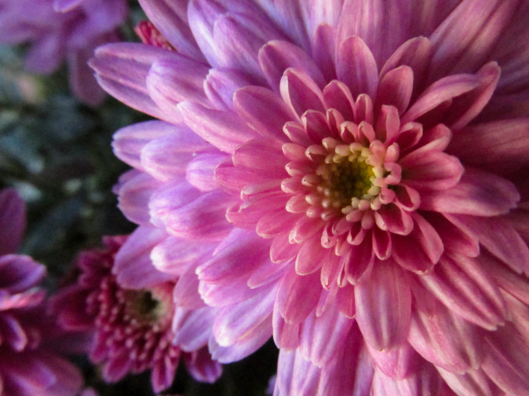
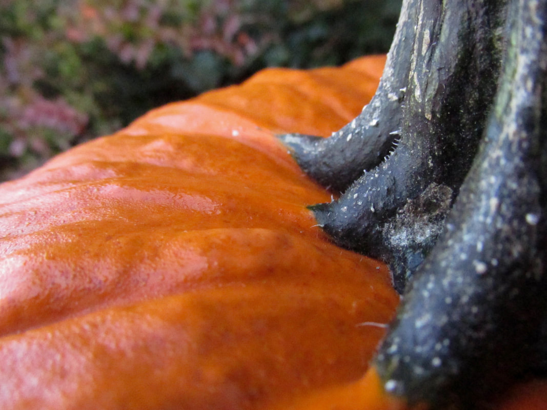
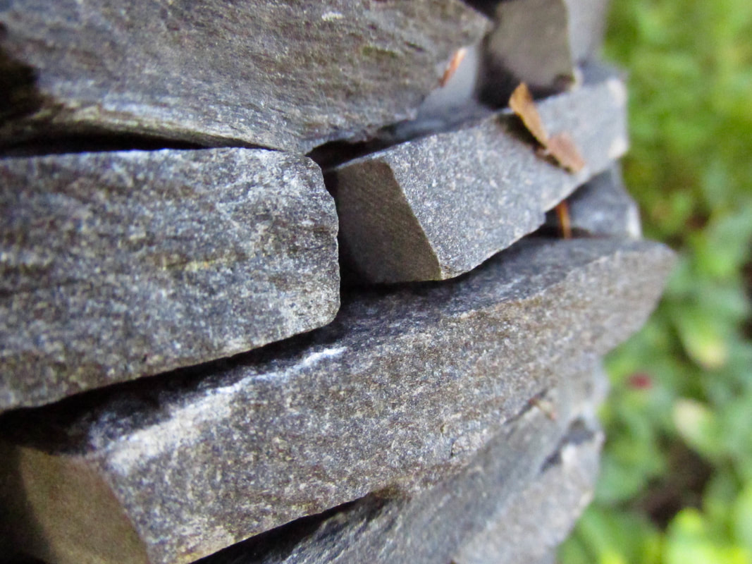
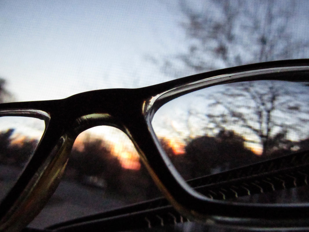
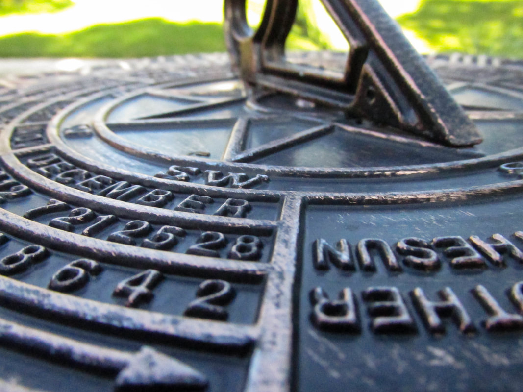
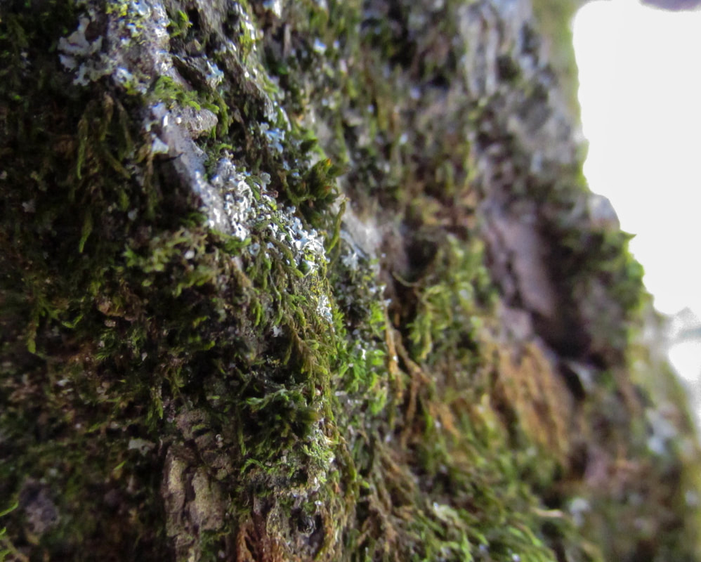
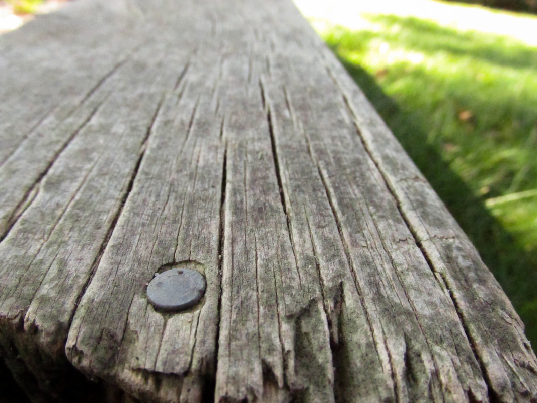
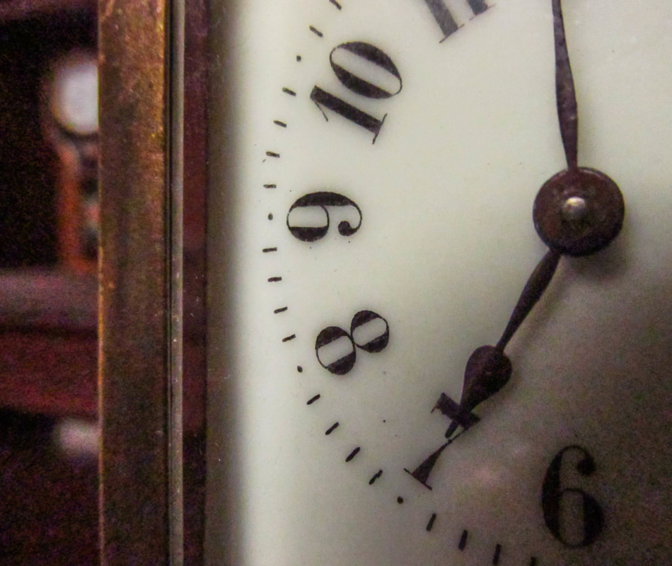
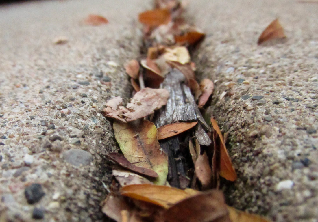
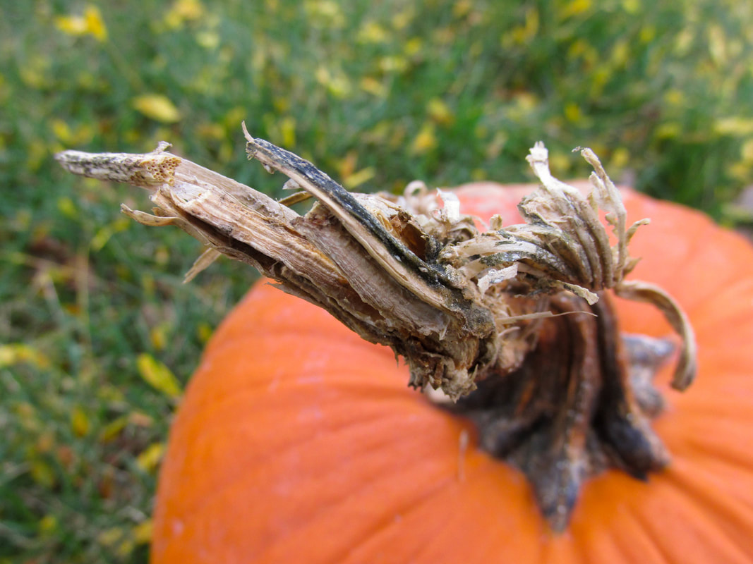
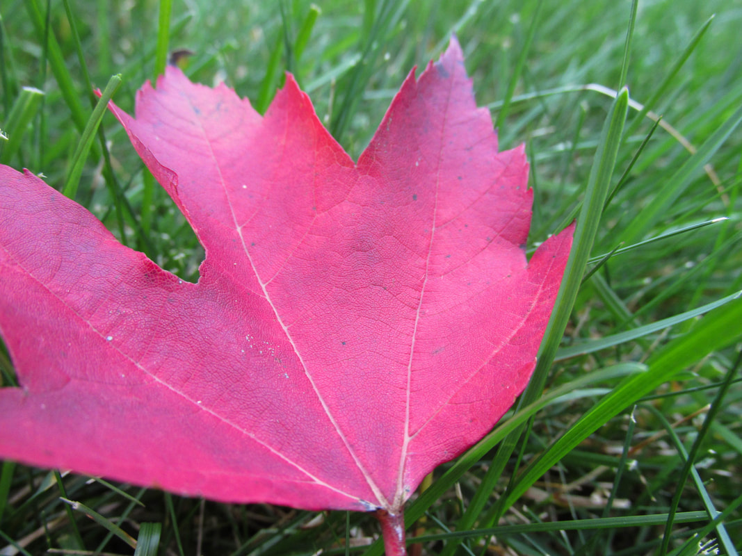
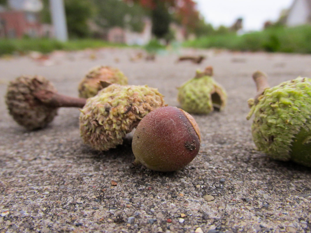
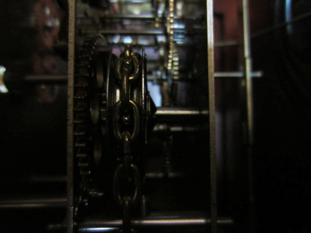
I did Macro as my subject for this assignment. To take these photos, I got very close to objects so that you can see all the little details. It is a view you do not usually see. I had a little bit of trouble with the camera warning that it was too close to something and with it not focusing on what I wanted it to focus on. It was also sometimes difficult to make sure that my shadow wasn't in the picture. I tried to find interesting things to photograph, things that you don't see every day. I also tried to get not just photos of nature, but of man-made things as well. 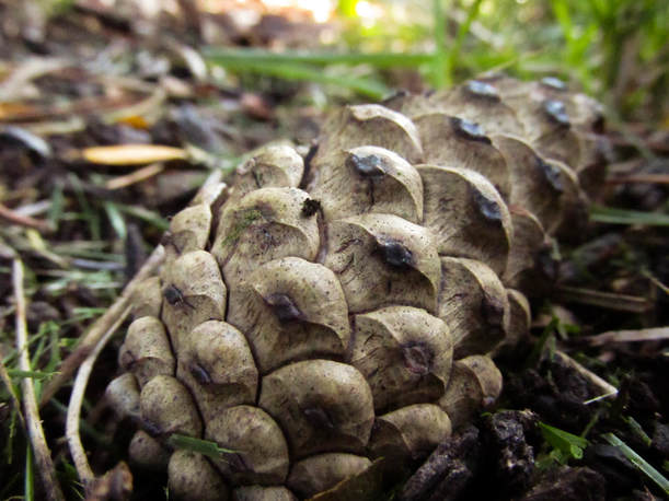 F 4.5, 1/400, ISO 1600 It was difficult to edit this picture. I thought it looked kind of neutral gray so I brought up the saturation a little. I also noticed that the pine cone was blending into the background so I tried to bring more contrast into it, and that is where I ran into trouble. Darkening the shadows separated it from the front but not the back too much. I tried brightening the highlights but I didn't like how much that made the pine cone shine. Eventually, I just settled with a mixture of both.
1 Comment
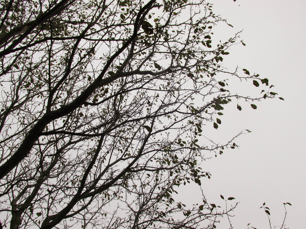
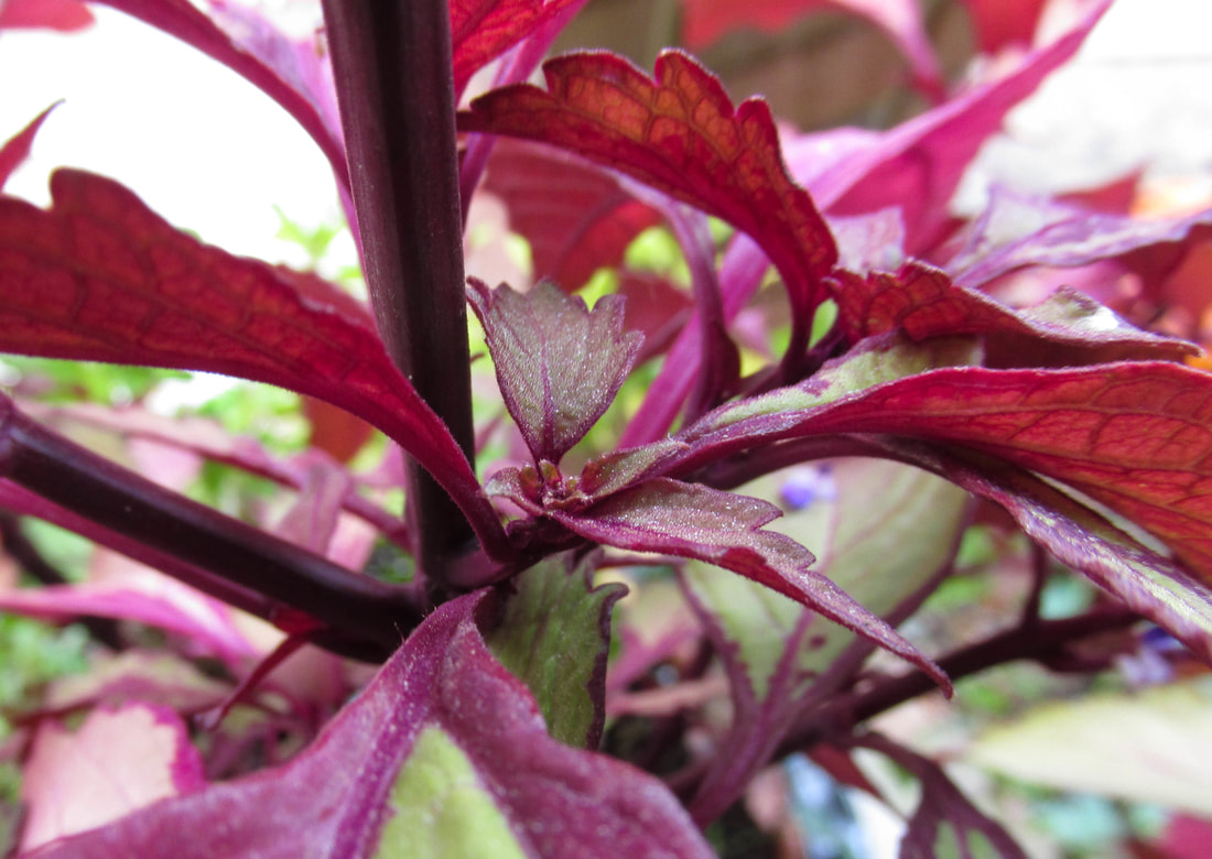
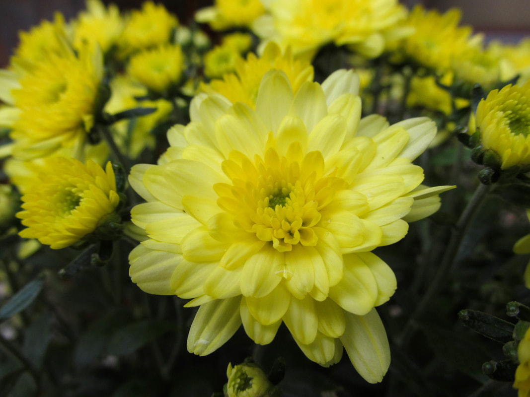
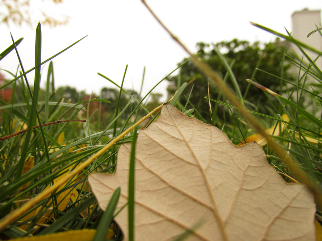
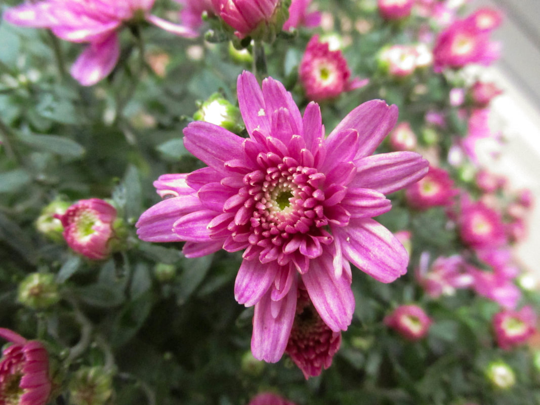
As you can see, the "Before" car looks quite different than the "After" car. This is because it has been edited a lot on Photoshop. For this assignment, Mr. Bush had us all turn the same picture into a shot more focused on the car. He gave us an example of how it should look when we were done, and then he took us through the Photoshop process step by step. We brightened the colors, cropped it down, and took away the background. I especially liked using the Stamp tool to cover distracting bits of light on the front of the vehicle. I think that the photo looks at lot better at the end than it does in the beginning. It is fun to take pictures of nature because it is so beautiful on its own. I went around my house to do this assignment, and I wasn't sure I would be able to find much variety, but I actually was. It was hard to take still shots of plants sometimes because the wind was blowing, and the sky was cloudy so I had to raise the ISO a little. I also had to brighten almost all my photos when I edited them, because they were pretty dark. I tried to take some autumn-ish pictures, but also to get some of the last remainder of summer. All in all, I am quite happy with how they turned out. 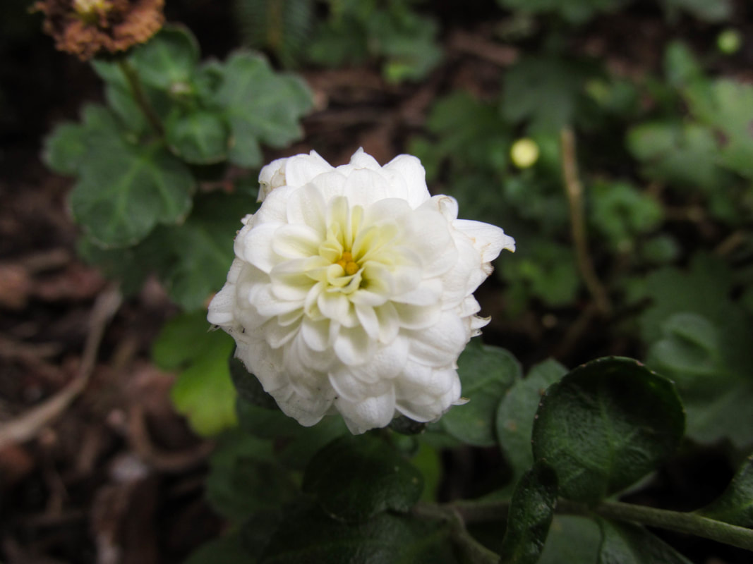 F 3.5, 1/50, ISO 100 For editing in this photo, I darkened the shadows and lightened the whites a little more to bring more contrast. I then raised the saturation to bring out the slight colors, like the yellow in the petals of the flower. For this assignment, we turned a photo of a person into an Andy Warhol-like picture. We used any portraits that we already had, or took a photo of ourselves. It had to be a full face shot. We then used Photoshop to copy the picture and change it into four different colors. During this project, I learned about all the different tools available in Photoshop. I didn't know there were so many! I learned how to copy and adjust a picture using Layers, Guides, Resize the Canvas, and others, until it was how I wanted. Also, I learned who Andy Warhol is. I had seen this type of pop art before, but I didn't know who created it.
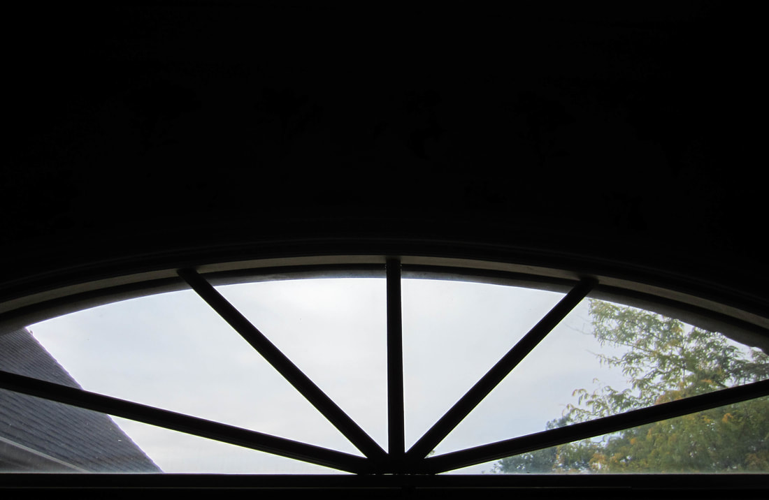
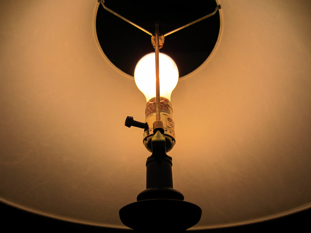
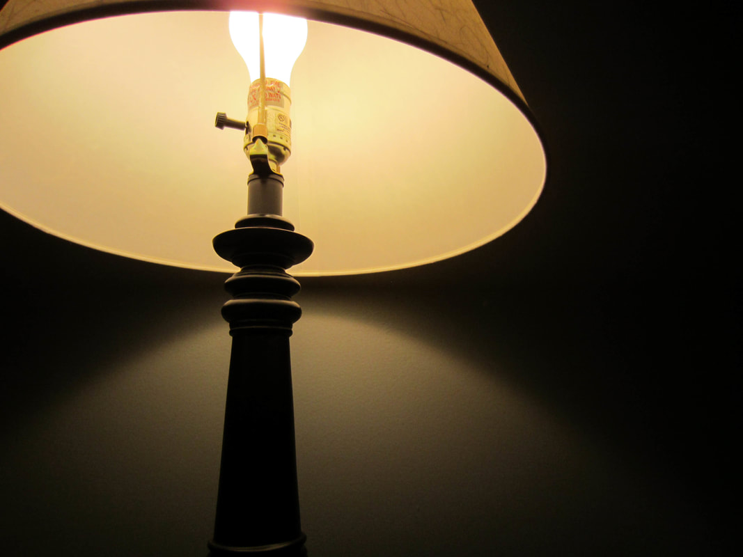
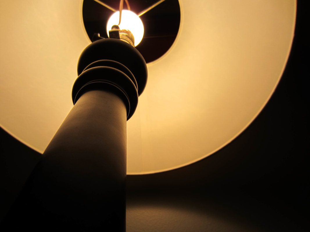
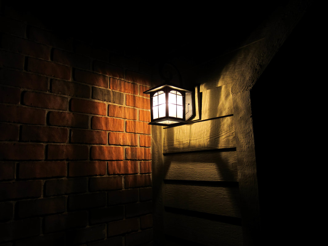
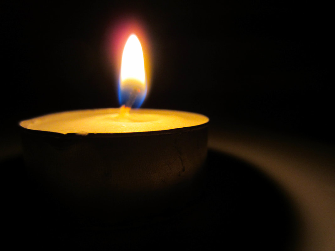
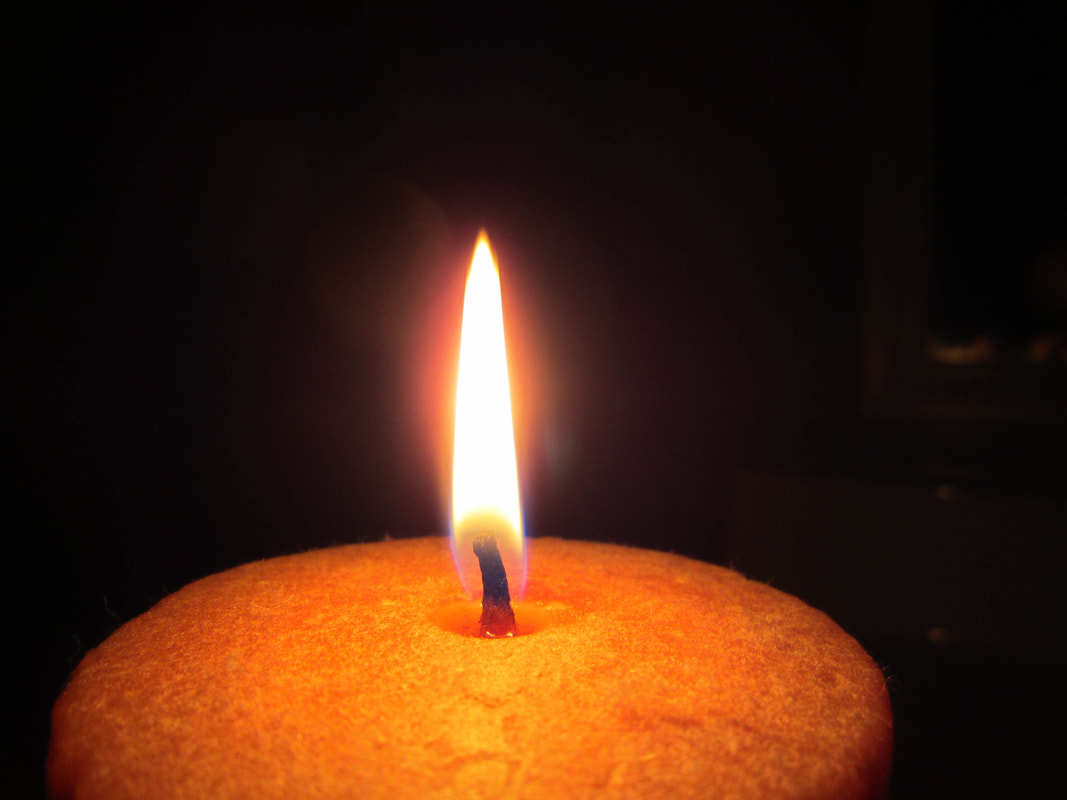
For this assignment, I shot photos showing the contrast between shadow and light. I noticed that as soon as I made up my mind to do this assignment, I started seeing examples of it everywhere. I shot in and around my house. I wanted to get some photos of fire so I lit some candles. I think that they turned out pretty well, though I wish I had more pictures with actual shadows instead of just darkness. I learned that you don't need a flash to get a good picture in the dark. If you use a lower aperture, the camera lense will be widen and will let in more light. If the ISO is higher, more light will be let in too. 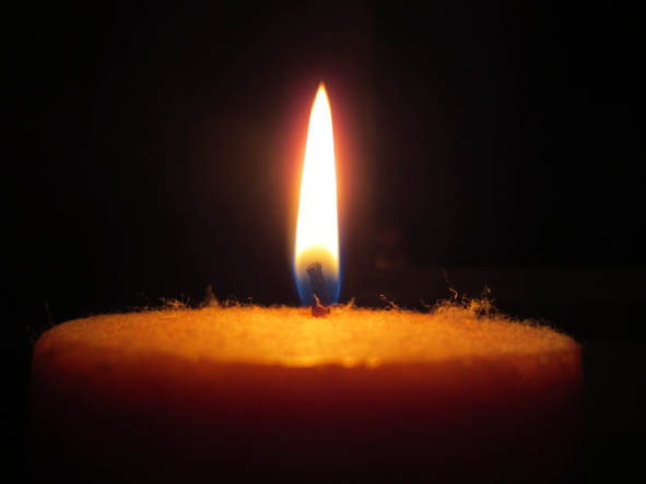 F 2.7, 1/40, ISO 200 I actually did not do any editing to this picture at all. I decided to keep it natural. I liked the amount of clarity and the colors in it, and I thought that there was enough contrast between the light and the dark. `Here are the following photos for inspiration for the Photo 1 assignment.
Photo number 1 Photo number 2 Photo number 3 I decided to work with light and shadow for this first assignment. These photos show the contrast that really interested me. I didn't even think that the stairway in photo 1 was real when I first saw it. In the second photo, I thought it was a cool idea to use forks to make something beautiful. I never would have thought of that. I love how in the third photo there is so much detail on the light side, and the other side just fades into darkness. I hope that my pictures turn out like these! For this assignment we had to take pictures showing eleven different elements of photography: rule of thirds, pattern, symmetry, texture, depth of field, lines, framing, perspective, space, balance, and color. We were able to go outside and walk around the school to get the photos we wanted. I went to my house and down to the track field as well. I learned that a photo can show multiple photographic elements. One picture might have texture, rule of thirds, and color! It was difficult to choose which photo would represent what. I also learned to take pictures from many different angles to get variety. Lastly, I learned about photoshopping to get the exact photo you want. I had a lot of fun shooting these. Enjoy!
I am Ella Bozzi. I'm a sophomore in high school and a sprinter in track. I play piccolo in marching band. I love to read and to draw, along with other forms of art. I've been taking pictures for a few years now, and I really enjoy it. I am just learning how to edit and photoshop now. It is pretty exciting. I hope to become a much better photographer this year!  |